You may not know all the best practices for website navigation, but you can probably tell when they haven’t been followed. Have you ever landed on a website and been unsure of where to click in the top navigation? Or, felt overwhelmed by crammed stacks of links in the footer?
If you have, that confusion was likely created by a mix of communication, website design and site hierarchy problems, and it could all be fixed using best practices for website navigation.
What is website navigation?
Website navigation refers to the menus on a website that direct users to internal pages on that site. It includes the top menu bar, links in the footer and sidebar menus. But, website navigation design is much more than that.
Internal link architecture is a sort of map that shows how pages on a website are connected to each other. It conveys importance, adds context to pages by connecting them to other pages and shows a hierarchy of information — the most important information is at the top and funnels into more and more detailed information.
Why does website navigation design matter?
Good website navigation design serves both users (by helping them know where to go next) and search engines (by helping them understand the information on your website).
An intuitive and well laid-out navigation structure can help:
- Increase search engine rankings and drive website traffic.
- Increase time-on-site and number of page views.
- Improve user experience.
- Increase conversions and on-site sales.
When you use good website navigation design, it benefits readers, search engines and, ultimately, your business.
10 best practices for website navigation
Use these 10 best practices for website navigation to improve your existing site structure or create a plan for your new website. Just remember, these are best practices. Use them to guide your process, but make adjustments based on what is best for your audience and industry.
1. Start with a site map
If you don’t know where to begin with your website navigation design, start with a site map. A site map is a list of all of the pages on your website. It outlines your pages by starting with primary categories and themes and then defining pages within those main ideas. Use the site map to determine which primary navigation items you need across your main nav and footer.
2. Cater to visitor wants and needs
Best practices for website navigation should be primarily focused around your users. You want them to be able to land on your site and quickly find the information that is the most relevant and useful to them. Consider the journey that users go through on your site on their way to converting. What are the pages that every user needs to see? Make sure those pages are featured in your website navigation.
Recommended reading: Customer journey mapping for web designers and developers
3. Use descriptive, short menu titles
Long menu titles can clutter the navigation and make a website look messy on mobile, so use short titles when possible. Cut titles down to as a few words as possible. Ideally use one or two words, but use enough of a description that users — and search engines — can predict what they will find on each page.
4. Limit the number of menu items in the top navigation
Just as too many words in menu titles can clutter a navigation, so can too many options.
People scan websites to quickly find what they need, and they can’t do that if there are too many options.
Website expert, Andy Crestodina at Orbit Media says to limit the number of menu items in your main navigation to seven.
5. Don’t use more than two menu levels in the top navigation
Complex businesses may need to use more than seven menu items in their top navigation. You can use dropdowns to add more items, but keep it to two menu levels. Don’t use a dropdown that leads to another dropdown. Instead, consider using a “mega menu” that populates a larger menu from the main navigation.
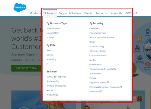
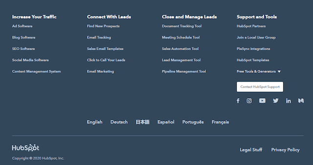
6. Use menu headings in “fat footers” and “mega menus”
A “fat footer” is a navigation structure at the bottom of a website that includes multiple menus and links. If you use a “fat footer” or a “mega menu” that has a lot of links, incorporate headings to help categorize the links and make it easier for users to scan.
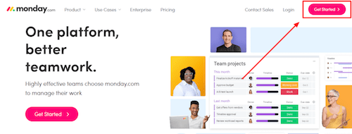
7. Add a call-to-action button in the top navigation
Use your main navigation to drive audiences to the primary call-to-action (CTA) on your site by adding a button. A colorful button with a clear CTA can help website visitors easily see the next step you want them to take.
Related: 8 costly call-to-action mistakes you’re making on your website
8. Experiment with sticky top navigation menus
A sticky top navigation is a menu bar that remains at the top of a webpage even as the user scrolls.
When your top navigation includes your site’s most important pages that your audience will want to and need to explore, consider using this type of sticky menu on your site.
This is especially useful if you have a CTA button in the menu as it is always available for users to click.
9. Consider the mobile view of your menus
Responsive website design adjusts the layout of a website based on screen size. Websites adjust to create an optimized experience for the user, whether they are a small mobile device or large desktop. Keep this in mind while laying out your menus. Test your menu on different screen sizes. Make sure long menus don’t take up too much space and that hamburger menus (three-lined icons) are visible and easy to access.

10. Use your analytics to improve
Earlier in this post, I mentioned that these are best practices for website navigation, but they are not set in stone.
Use Google Analytics to monitor results, see what works best for you and adjust based on what you learn. Look at your analytics and use heat-map tracking to determine how people use your site, and then iterate to improve user experience and results. You may need to:
- Remove or rename menu items that are rarely clicked.
- Make it easier to get to pages that have a lot of views.
- Move menu times that get a lot of clicks to the top or front.
Recommended reading: What is website analytics — and how can it help your business grow?
Keep improving your website
Your website is always a work in progress. Use these best practices for website navigation design to improve user experience, boost SEO and drive more conversions. And then, see what other changes and updates will make your website even more effective. Get more tips in the GoDaddy guide 10 elements of an effective small business website homepage.
This article includes content originally published on the GoDaddy blog by Christopher Ambler.
The post 10 best practices for website navigation appeared first on GoDaddy Blog.